Case Study · UX Research & Design Strategy

From Supply Chain Data to Client Value Stories

A UX research and design engagement for a healthcare distributor: turning fragmented supply-chain data into a single, trusted value-reporting platform for account teams.

Executive Summary

Business Impact

A UX research engagement that replaced days of manual data-hunting with a single, trusted value-reporting platform account teams could use in every client review.

What Leadership Wanted
A single, trusted source of truth proving the company's supply-chain value beyond cost of goods, replacing days of manual data-hunting before every client review.
Workflow Friction
Disconnected systems meant nobody, including the data and development teams, understood how the pieces fit together. Reps didn't trust the numbers, and unreliable data derailed client meetings.
Business Outcome
I restructured the information architecture around a clear client narrative and configured it into their existing Salesforce system instead of building new. Manual prep was eliminated, a stalled dev team was unblocked, and client conversations shifted from pricing debates to business value.

Overview

At a Glance

Role
Lead UX Researcher & Design Strategist
Context
A client-facing value-reporting platform for quarterly business reviews, populated by data pulled from multiple siloed internal systems.
Methods
Discovery research, qualitative interviews, thematic synthesis, end-to-end journey mapping, information architecture, wireframing, prototype testing, design iteration.
Deliverables
Research findings, user journey, jobs-to-be-done, use cases, information architecture, wireframe designs, and annotated design and interaction instructions for the development team.
Scope
Discovery research, experience strategy, information architecture, interaction design, user validation, low-fidelity wireframes.

01 · The Situation

The data to tell a value story, but no way to tell it

A large, regulated healthcare distributor had the data to tell clients a value story, but no way to do so quickly, consistently, and easily.

Account reps had strong client relationships and met quarterly for business reviews. Leadership wanted more from those conversations: the value clients received beyond the cost of goods (VBCoGs): the supply-chain efficiencies and operational savings clients were getting but couldn't quantify on their own.

To tell that story, account teams needed data and analysis. The data existed, but it lived in disconnected, siloed systems owned by teams who weren't always willing to share it.

In its current state, preparing for a quarterly review meant days of manual effort just to identify and track down the data, and understand it well enough to walk into a client conversation with a compelling story.

02 · The Main Problem

Nobody could see the whole picture at once

Initial conversations with stakeholders showed that nobody, not the stakeholders, not the data team, not the account teams, not the vendor building the infrastructure, had a complete understanding of what needed to be built or how it would actually work.

Each team owned a piece of that knowledge, but none could see it in full.

That was the gap I was there to close.

03 · My Process

Start with business outcome, not an interface

Every interview I had with account reps uncovered another piece of the puzzle, but no one could explain the entire process end-to-end, because no one actually owned it.

The design challenge wasn't about creating a dashboard. It was about understanding what they needed to build, and answering the questions that would tell us whether it was worth building at all:

  1. Do account reps understand the value they deliver beyond cost?
  2. Would account reps actually use a tool like this?
  3. Would data pulled from different systems tell a compelling value story?
  4. How would stakeholders define success?
  5. What did account reps need to accomplish in client conversations?
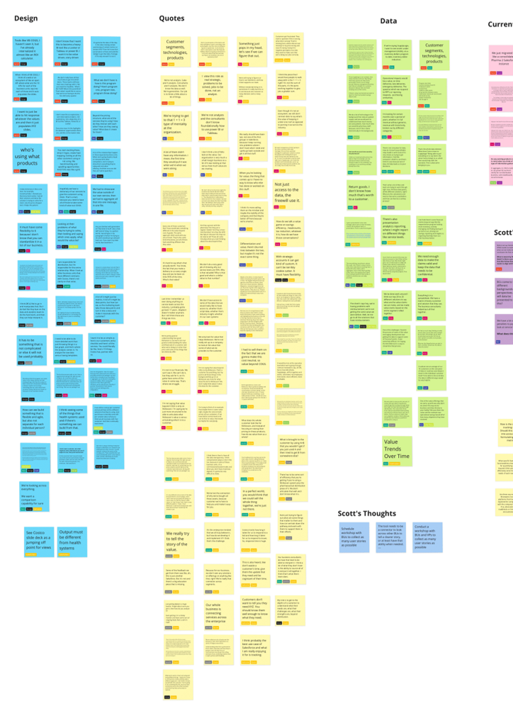
Research synthesis
Visioning workshop and affinity synthesis board
Visioning workshop outputs and interview themes, clustered into the value buckets that drove the information architecture.

04 · Discovery

The effort wasn't the problem. The system was.

The problem wasn't that reps lacked effort. It was that the current system made a value story difficult to tell.

Preparing for a single client review often meant opening multiple disconnected systems, exporting spreadsheets, requesting reports from other departments, and manually combining everything into PowerPoint. Much of that work wasn't analysis: it was simply hunting for information.

Even after spending days assembling the presentation, reps still questioned whether the numbers were current or complete. Because each report came from a different source, they spent valuable meeting time explaining where the data came from, instead of discussing the value they'd delivered to the client.

Stakeholders were aligned on what success looked like too: a rep walking into any review able to state the client's value in minutes, backed by numbers they trusted, without hunting for the story first.

05 · From Insight to Design

Making the invisible visible, and buildable

From the themes, I mapped the end-to-end journey, defined the information architecture, and built wireframes that made the intended experience visible and discussable across the whole team.

The wireframes were the turning point. The vendor had struggled to understand what they were building. Once they could see it, the work gained momentum. Three rounds of prototype testing followed, iterating against real user needs and what was feasibly buildable.

During testing, several participants naturally looked for a client-level summary before diving into detailed metrics. My original navigation surfaced operational data first, forcing users to piece the story together themselves. I reorganized the experience around the client narrative: starting with overall value delivered, then letting users drill into supporting metrics.

Catching that before development avoided building the information architecture around the internal data model instead of the user's mental model, which would have required significant rework later.

Making Sense of the Data

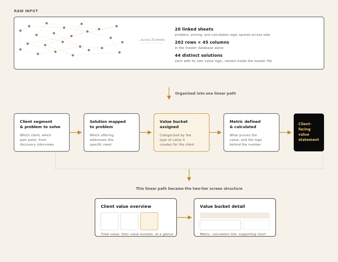
The IA started as a spreadsheet of dozens of columns and rows of unstructured, complex data, value categories, and calculation logic spread across disconnected tabs, with no single view of how it all connected. Before I could design anything, I read through it and found the patterns nobody else was able to find. Stakeholders knew the data they needed was in there, but not how to organize it into a linear structure that could lead to a design.

Making sense of ambiguous, complex data is a skill I bring to every engagement, and this project is a clear example of it in practice.

Information architecture
Information architecture diagram: research input organized into a linear path
Information architecture: organized around messy stakeholder data that I cleaned and reassembled to show linear content structure.
Wireframes
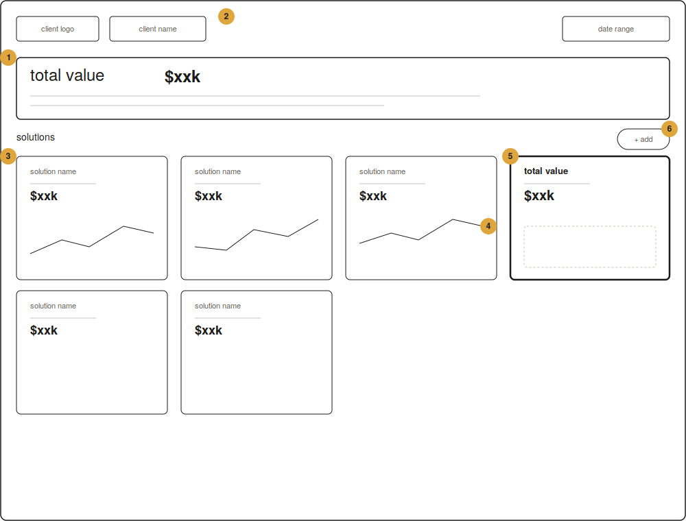
Low-fidelity wireframe of the client value overview dashboard
Low-fidelity wireframes turned an abstract idea into something the whole team could see, react to, and build against.
Wireframes
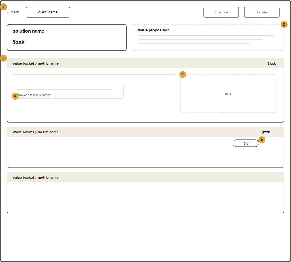
Low-fidelity wireframe of the account drill-down and value bucket detail
Drill-down reorganized around the client narrative: value delivered first, supporting metrics and proof points beneath.

Annotations Explained

These are the annotations for the image above.

  1. Total value banner: shows total value delivered to the customer, immediately framing the discussion around what the client received before any operational detail.
  2. Client and date selector: filtered view pulling from all connected sources.
  3. Solution card grid: assembled per solution, directly resolving the "days of manual effort" pain point from discovery.
  4. Trend line in each card: gives the rep a ready-made narrative that tells a clear story, instead of raw numbers to interpret.
  5. Total value summary cards: answers the question "what does success look like" as the sum, not the parts.
  6. Add button: designed to extend to new solution lines without restructuring the page, a scalability concern flagged during discovery.

Annotations Explained

These are the annotations for the image above.

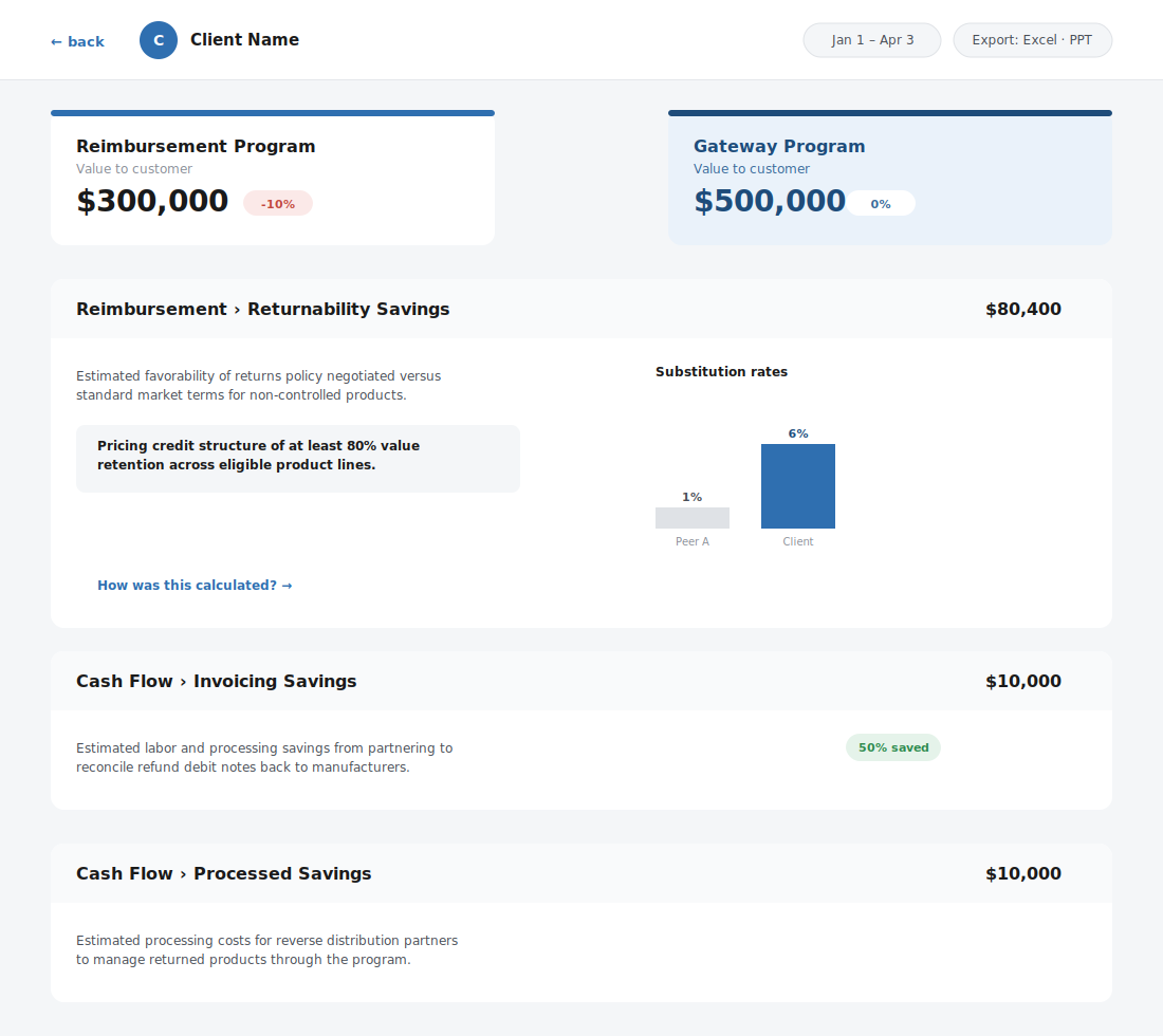
  1. Back navigation and client selector: keeps the rep moving between summary and detail to provide one continuous flow without leaving the tool.
  2. Value proposition callout: plain-language the rep can read during a client conversation, removing the need to paraphrase under pressure.
  3. Value buckets: grouped by relevant value, translating the four themes into structure.
  4. Supporting chart beside each bucket: visual proof that provides clarity for reps to defend and clients to understand.
  5. "How was this calculated?" link: direct path to methodology, the single highest-value line on the screen, and the literal fix for the trust issue surfaced in discovery.
  6. Percent change indicator: answers "what changed since last time" before the client can ask, shifting the rep from defensive to proactive.
Validated design
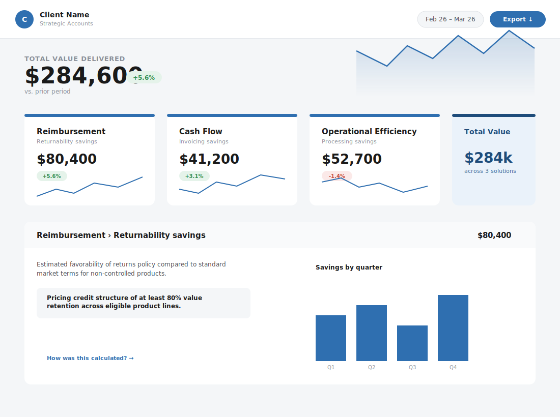
Validated client value overview dashboard, mid-fidelity, branding removed
The validated design, shown here as delivered, with client branding removed for this case study.
Validated design
Validated account drill-down and value bucket detail, mid-fidelity, branding removed
The validated design's value bucket detail, shown here as delivered, with client branding removed for this case study.

06 · Delivery Decisions & Outcomes

Configure what exists, don't build from scratch

Stakeholders chose to deliver through an existing platform (Salesforce) with an embedded analytics dashboard rather than build from scratch.

My validated design gave them a predefined framework to build against.

As discovery progressed, it became clear that the core challenge wasn't a lack of reporting technology: it was the absence of a shared workflow and information architecture.

My research and validated wireframes demonstrated that the experience could be delivered by configuring Salesforce around the user workflow, rather than creating an entirely new product. That decision reduced implementation risk while preserving the user experience.

In Their Words

"Thank you, @Scott Faranello, for diving headfirst into the deep end the past 2 months; you've absorbed so much knowledge and bring a fantastic perspective and level of rigor to our team."

Project team, mid-engagement

"Scott asked fantastic questions and moved the conversation exactly where it needed to go, while adjusting quickly in real-time."

Program lead, following a stakeholder session

"Conceptually, this is amazing... This tool is better than anything I've seen for capturing value before, and I'm excited about it. While the data piece continues to need work, your efforts will have a decided impact on the way the largest sales segment at the company operates! Thank you!"

SVP, Strategic Accounts, at launch training

07 · Reflection

Complex problems don't need more process. They need clarity.

On a complex system, the fastest path is often getting everyone to see the same thing at the same time. By grounding the work in real user conversations, using design to create visibility and collaboration, and keeping the business goal in front of every decision, I helped a cross-functional team move from ambiguity to a validated, buildable direction.

The shared picture I built through research was the thing that unblocked the work and what I am most proud of.